Wonk Variable Typeface, Senior Project
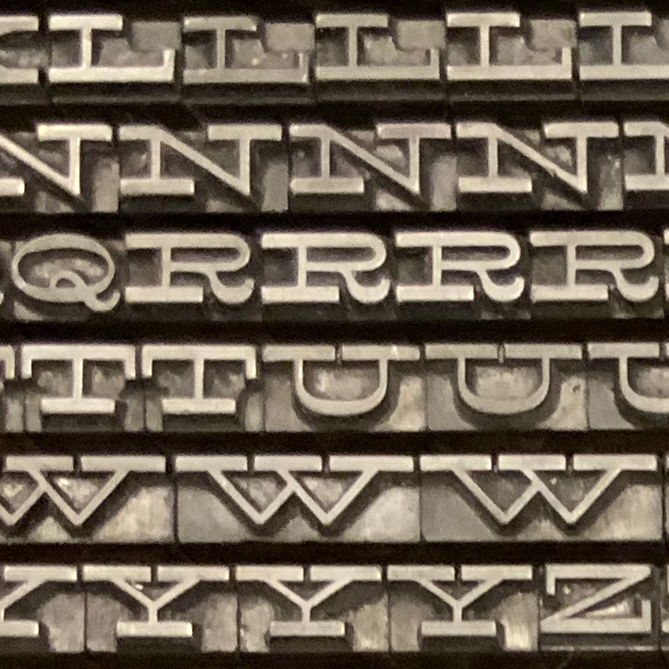
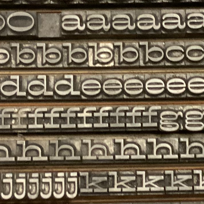
For my senior project, I developed a variable typeface based on metal type specimens found in MassArt's TJ Lyon's Collection.

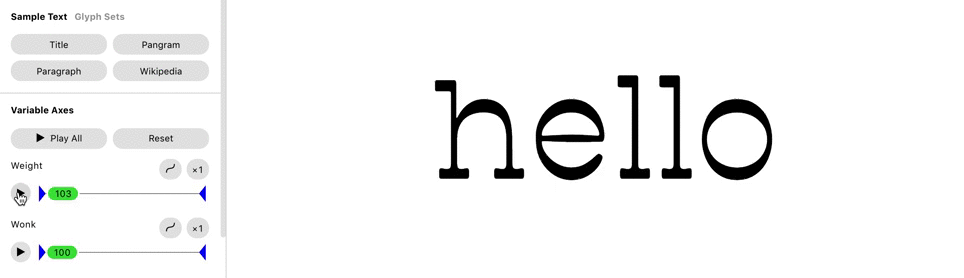
What is a Variable font?
A variable font is a dynamic font that is controlled by one or more axiis. This technology was released in 2015, and since has been adopted by Adobe, Sketch and other design programs. The major benefits of variable fonts include smaller font sizes, and larger font families.


Paul Barnes & Commercial Classics Inspiration
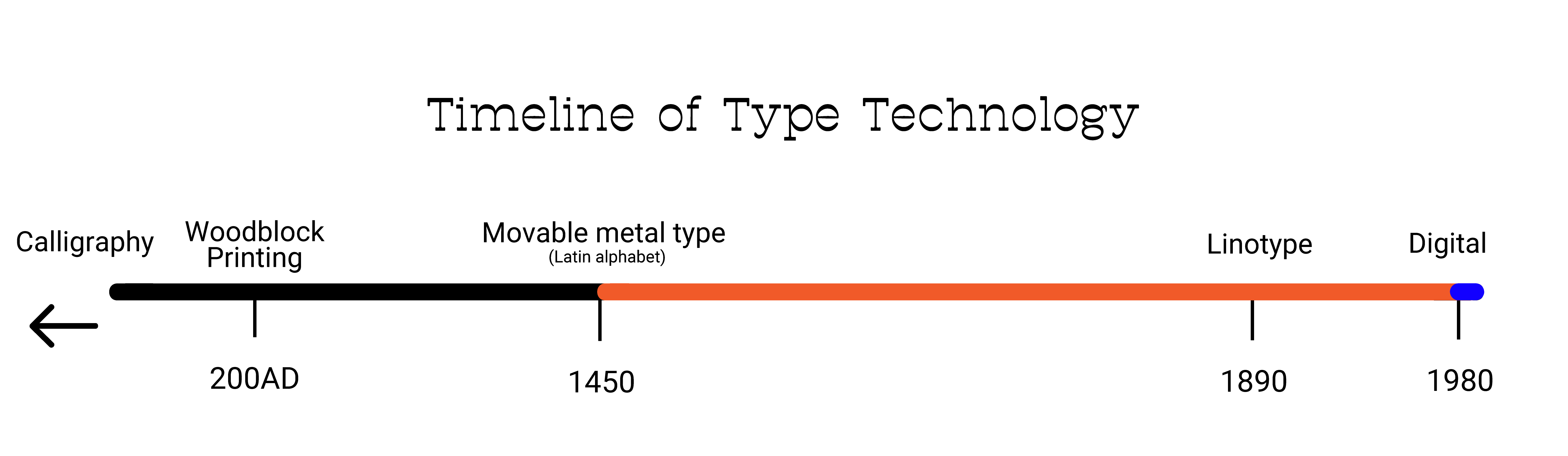
In Fall 2019, I went and saw a lecture by Paul Barnes of Commerical Type Foundry. The lecture was about reviving 19th century metal type.
When asked how he thought about variable fonts, Barnes said he didn't see much use for them. With that I decided to "revive" 19th century metal type using variable font technology
Inital Research

First Drafts/Reference
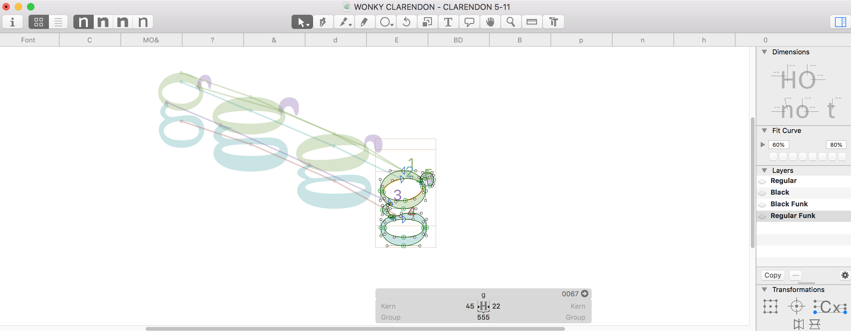
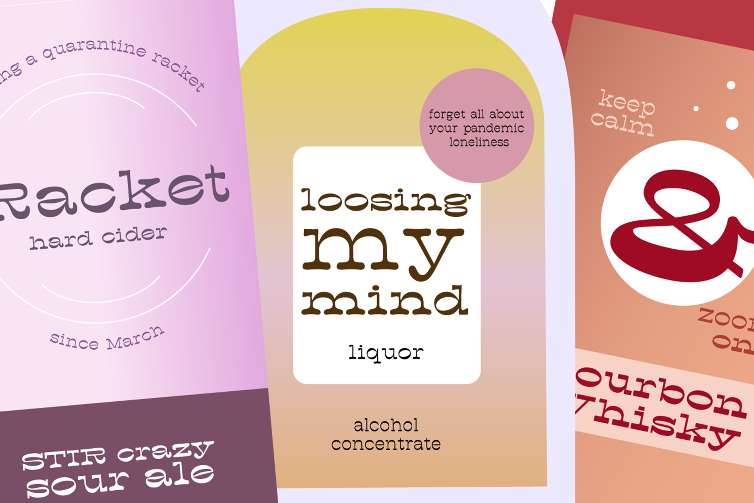
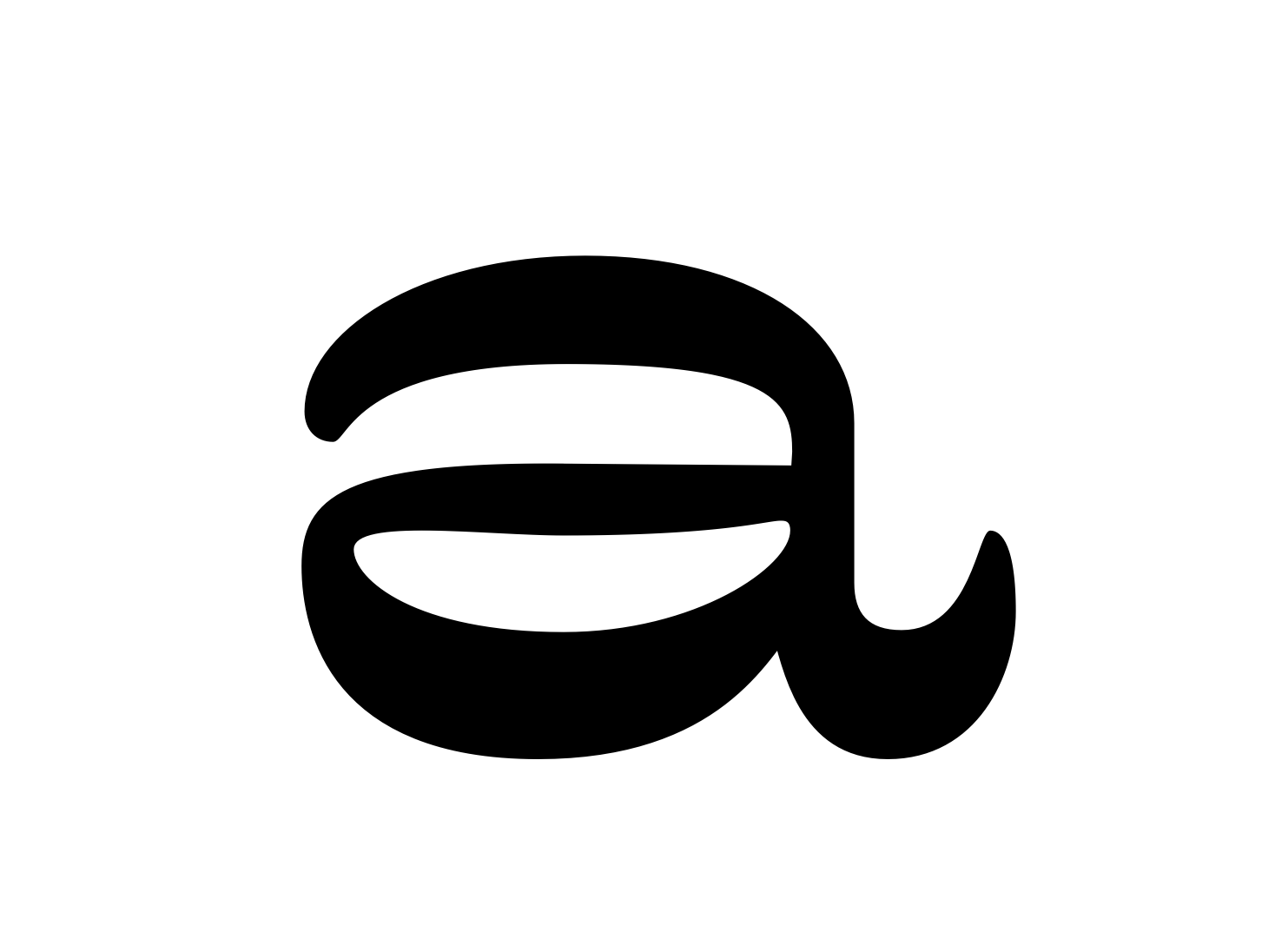
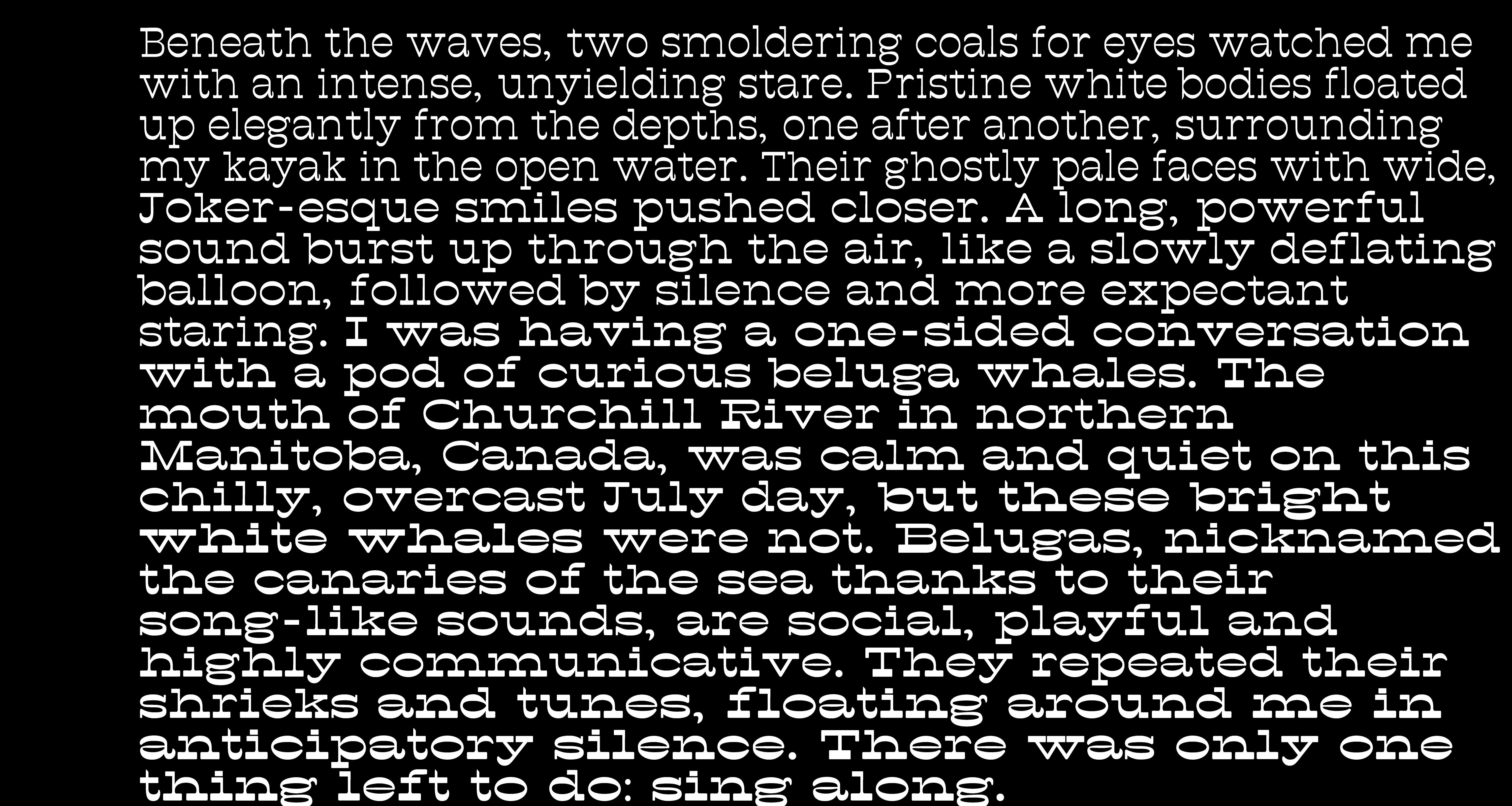
I chose a reverse stress Clarendon Extended and began experimenting with type design on a variable axis. Initially, I wanted to increase usablity of the style by creating a lighter weight version, for longer form type, expanding the use from just a display face to a subtitle, short paragraph usage.
I then tested the two variations, one at each end of the axis.

I after determining the weight for a few letters, I then drew the rest of the alphabet.
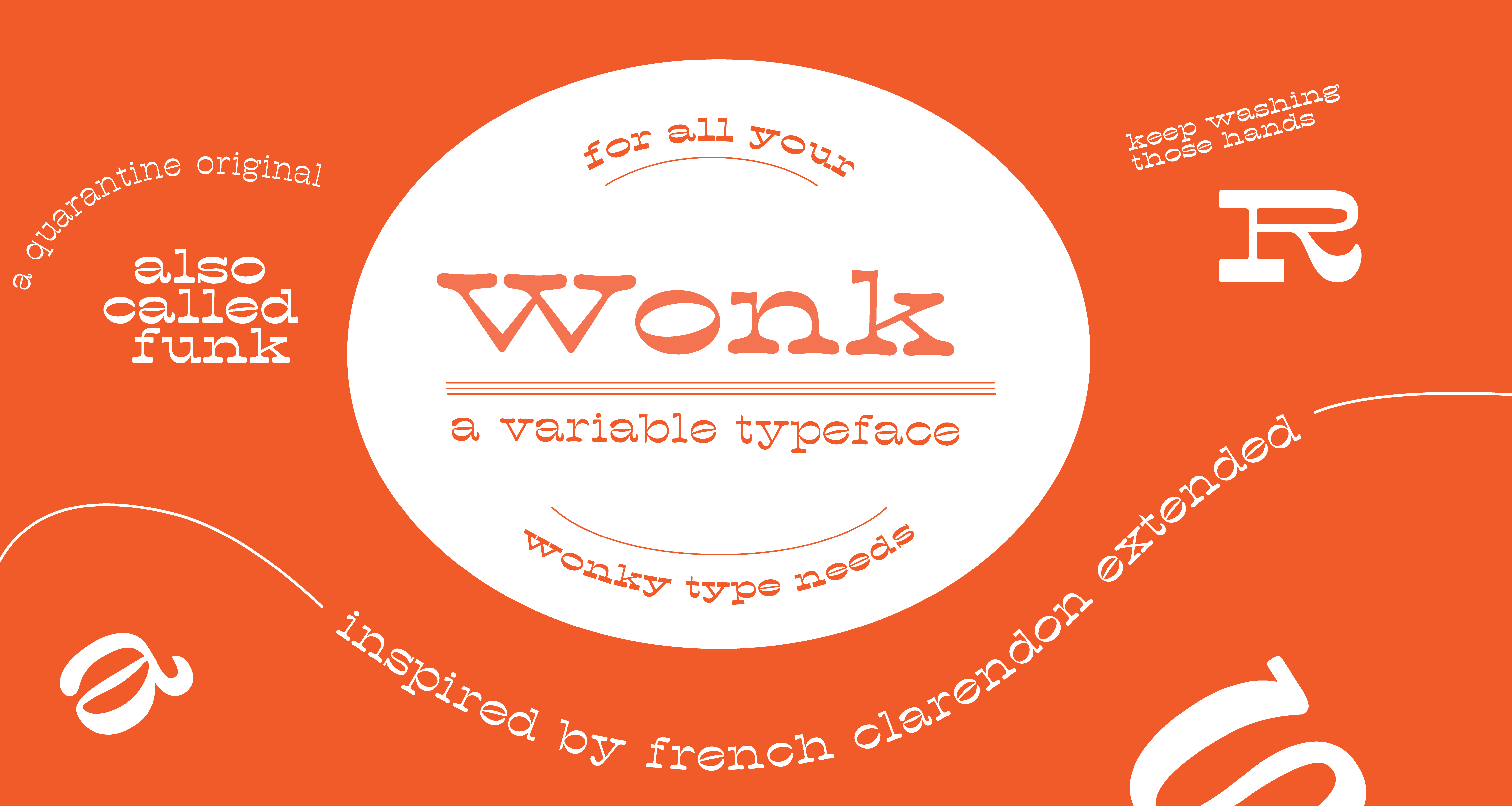
Adding some "wonk"
After creating the display and light weights of this variable font, I wanted to add another axis that would contribute to the overall versatility of the typeface. Instead of turning up the practical, I wanted to turn up the silly, and add a fun variable. In experimenting with some curves and dimenstionality, I settled on "wonk."